
Navigation
Notifications
Post a comment on the text below
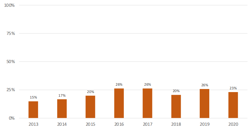
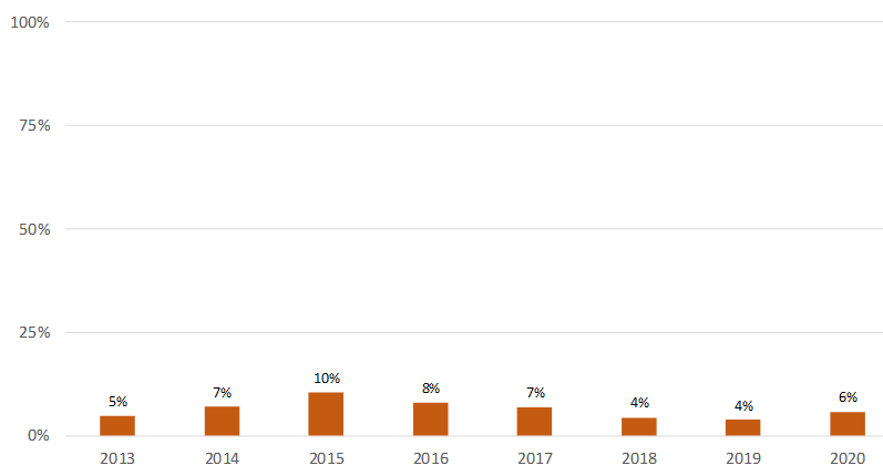
Figure 1. Percentage of reported monitoring sites with pesticides exceeding thresholds per year in a) surface waters and b) groundwater in Europe weighted by country area.
a)
b)
You cannot post comments to this consultation because you are not authenticated. Please log in.
Previous comments
it would be useful to add some error bars on this chart
PT: In order to make the chart easier to read, it should be colour-coded.
AT
Both figures are misleading as they suggest that this is a presentation of a temporal development over the time period. But, there is an imbalance as regards the number of pesticides monitored , the monitoring frequency and there is no consistency in terms of monitoring sites over the whole time period per country. The comparison over time does not indicate, whether the total amount of pesticide exceedances increases or decreases. Please see further comments in Section 3.
Totally agree with Andreas :
No information (even in methodology and final annex) about evolution of :
Changes in methodology of reporting since 2015 (majority aggregated data before and disaggregated since) could influence lot this evolution, as starting with reporting of new countries, add of new monitoring sites (1/3 more), double of annual records and of number of reported pesticides over the period, etc. all these variables impact the final proportions…
Important point : the majority of observed values are under the LoQ. And this LoQ is decreasing over the period (improvement of analytical methods), so influencing in the same way annuals means and therefore also the reported monitoring sites with pesticides exceeding thresholds per year.